Ok, so it's not about color but I wanted to help you fellow artists who stretch their own canvas. First off, both Tony and I stretch, prime and prepare all our canvas and for the last few years have been using the genius method of James Bernstein, a conservator who I believe came up with this fantastic method of stretching canvas. It takes longer but the results are great. I highly recommend it! Just google his name and it should be under a GOLDEN acrylics article.
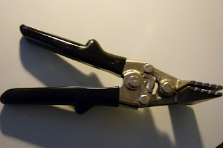
Anyway, if you stretch you canvases you really need a sturdy pair of canvas pliers to make your work easier and most pairs out there are cheap, break easily or are solid and quite expensive. After using this pair of pliers (above) for the last few years that I paid quite a bit for, I realized after a visit to Home Depot that they are identical to a hand-seamer tool used to bend sheet metal albeit slightly modified. They have a tab that is welded onto them to use as leverage against the inside of stretcher bars so you can attach the canvas to the back - "gallery wrap". These pliers are heavy yet great but at around $100 it seems a bit steep as the tool wasn't actually designed by artists but was simply modified. It left me wondering how much that modification really costs..
I wanted a 6" pair (my current bought pair was 3") for large canvases and they can be even more expensive so I figured it should be worth trying to replicate. I did, it worked and was cost effective.. Here's what you can do. Scour ebay for hand seamers : 3" for most canvases, 6" for big canvases. If you intend to gallery wrap (attach canvas at the back) get the regular straight ones, otherwise get a pair of offset ones (for attaching the canvas to the sides). I got a 6" straight pair for $30 (see lower pic). Then take them to a local welder and have them weld a small tab (ask me if u need specs, it can be wider than shown but shouldn't be deeper than the narrowest stretcher bars you intend to use) onto one side of the jaws (on the gallery wrap types is doesn't matter which side but on the offset one it has to be the underside jaws and facing down to provide leverage). Make sure the tab is flush with the inside of the jaws. Cost me about $15. Voila! Done. So until someone comes out with the perfect pliers that isn't just an easily modified tool/ or expensive I'd rather save my money with these.

I hope this helps some folks out there. If you need more specs send us email or comment!


