It's official. I finally finished the second volume of color : Making More Sense of Color.
It's available both on Amazon and CreateSpace. It was alluded to in our first volume which does not address color observation and color design (both are secondary to color anatomy). This new book builds on the knowledge of color anatomy and lays out the issues of how to best practice color interpretation through observation. It also addresses color optics for those wishing to learn more about color without falling into a school of thought or technique.
More to follow!
Tuesday, September 18, 2012

Tuesday, September 4, 2012
The Sequel...to Making Sense of Color
So for those of you in the "know" we published our first color book a little under a year ago.. Making Sense of Color . If you got it, let us know what you think and if you bought it through Amazon, put up a review..
Anyway, that book only addressed color anatomy and I had to follow up on the other aspects of color observation and color design in a second volume...and that's what I've been working on!
The time is near for the printing of the sequel and it's currently under review so hopefully it'll be out by October for a clean anniversary of the first, making a set of two color books meant to complete each other.
I'll keep you posted!
Anyway, that book only addressed color anatomy and I had to follow up on the other aspects of color observation and color design in a second volume...and that's what I've been working on!
The time is near for the printing of the sequel and it's currently under review so hopefully it'll be out by October for a clean anniversary of the first, making a set of two color books meant to complete each other.
I'll keep you posted!
Thursday, June 14, 2012
Alga Norte Shovels
Wasn't really sure if this ought to be on my personal artwork/studies blog but figured it would do just as well here. These are the shovels I mentioned in the previous post. Carlsbad had the groundbreaking event for Alga Norte community park in Carlsbad, CA and these are the painted shovels I did. Time was short so these were painted graphically with a color design that would most likely invoke the concept of the individual parts of the park (dog park, playground, aquatics, skateboard and baseball field). Since graphic color is the driving force of the design I didn't need to focus on exact drawing or form. I think there is entirely too much focus on realistic lighting in illustration and to me , at least, a lot of my favorite illustrators were more casual about it as long as the feeling of the picture was right. A lot of that feeling came from the color scheme not the accuracy of lighting.
Anyway, just a little color design. Here are the quick digital sketches plus some photos from the event:


Last two photos courtesy of City of Carlsbad Website . Here's the link to more info about the park project..an exciting one for Carlsbad residents! ( http://news.carlsbadca.gov/pr/ca/new-park-officially-underway-235085.aspx)


Anyway, just a little color design. Here are the quick digital sketches plus some photos from the event:


Last two photos courtesy of City of Carlsbad Website . Here's the link to more info about the park project..an exciting one for Carlsbad residents! ( http://news.carlsbadca.gov/pr/ca/new-park-officially-underway-235085.aspx)

Saturday, June 9, 2012
Painting shovels...color design
I just finished a quick job for the City of Carlsbad. They are having a groundbreaking ceremony for a new park and asked me if I could paint some shovels with a design for each part of the park (five parts including dog park, aquatics etc..). Turnaround was pretty short (about a week) so I kept the design focused on color so the shovels would stand out from that alone. I'll post more hopefully after the groundbreaking event so you can see all the designs but the city has put up one pre-event pic on their facebook.
Enjoy..
http://www.facebook.com/carlsbadparksandrec?sk=wall
Enjoy..
http://www.facebook.com/carlsbadparksandrec?sk=wall
Monday, May 21, 2012
Canvas pliers
Ok, so it's not about color but I wanted to help you fellow artists who stretch their own canvas. First off, both Tony and I stretch, prime and prepare all our canvas and for the last few years have been using the genius method of James Bernstein, a conservator who I believe came up with this fantastic method of stretching canvas. It takes longer but the results are great. I highly recommend it! Just google his name and it should be under a GOLDEN acrylics article.
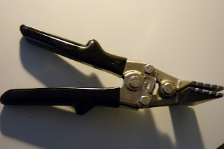 Anyway, if you stretch you canvases you really need a sturdy pair of canvas pliers to make your work easier and most pairs out there are cheap, break easily or are solid and quite expensive. After using this pair of pliers (above) for the last few years that I paid quite a bit for, I realized after a visit to Home Depot that they are identical to a hand-seamer tool used to bend sheet metal albeit slightly modified. They have a tab that is welded onto them to use as leverage against the inside of stretcher bars so you can attach the canvas to the back - "gallery wrap". These pliers are heavy yet great but at around $100 it seems a bit steep as the tool wasn't actually designed by artists but was simply modified. It left me wondering how much that modification really costs..
I wanted a 6" pair (my current bought pair was 3") for large canvases and they can be even more expensive so I figured it should be worth trying to replicate. I did, it worked and was cost effective.. Here's what you can do. Scour ebay for hand seamers : 3" for most canvases, 6" for big canvases. If you intend to gallery wrap (attach canvas at the back) get the regular straight ones, otherwise get a pair of offset ones (for attaching the canvas to the sides). I got a 6" straight pair for $30 (see lower pic). Then take them to a local welder and have them weld a small tab (ask me if u need specs, it can be wider than shown but shouldn't be deeper than the narrowest stretcher bars you intend to use) onto one side of the jaws (on the gallery wrap types is doesn't matter which side but on the offset one it has to be the underside jaws and facing down to provide leverage). Make sure the tab is flush with the inside of the jaws. Cost me about $15. Voila! Done. So until someone comes out with the perfect pliers that isn't just an easily modified tool/ or expensive I'd rather save my money with these.

I hope this helps some folks out there. If you need more specs send us email or comment!

I wanted a 6" pair (my current bought pair was 3") for large canvases and they can be even more expensive so I figured it should be worth trying to replicate. I did, it worked and was cost effective.. Here's what you can do. Scour ebay for hand seamers : 3" for most canvases, 6" for big canvases. If you intend to gallery wrap (attach canvas at the back) get the regular straight ones, otherwise get a pair of offset ones (for attaching the canvas to the sides). I got a 6" straight pair for $30 (see lower pic). Then take them to a local welder and have them weld a small tab (ask me if u need specs, it can be wider than shown but shouldn't be deeper than the narrowest stretcher bars you intend to use) onto one side of the jaws (on the gallery wrap types is doesn't matter which side but on the offset one it has to be the underside jaws and facing down to provide leverage). Make sure the tab is flush with the inside of the jaws. Cost me about $15. Voila! Done. So until someone comes out with the perfect pliers that isn't just an easily modified tool/ or expensive I'd rather save my money with these.

I hope this helps some folks out there. If you need more specs send us email or comment!
Friday, May 11, 2012
Questions about color?
Color is complicated, no doubt about that which is why I'm hard at work making the second book to follow up on the first one (Making Sense of Color). This next one focuses on color observation and color design. It's going to clear up some common myths which I feel are propagated in modern teaching, even in "good" art schools. Color is not tied to any type of visual art (realism, photo-realism, abstract, representational etc.) and I really hope this next book will allow people to learn color in a way that is very individual yet truthful.
In the meantime, what sorts of concerns do you have about color and why?
In the meantime, what sorts of concerns do you have about color and why?
Thursday, May 10, 2012
Black is not Black, White is not White

Here is a series of block quick-sketches (10-15min) done on a mostly cloudy day with some intermittent creeping sun, done about every hour. The point here is to observe subtle light changes throughout the day. The paintings are not overly chromatic but subtly intense and I'm not sure how well they would read online compared to the originals as they are layered and impressionistic (which is always a problem with photographical translation so I tweaked in them to look a little more correct on a computer though this makes them less subtle compared to the originals). There are some important things to note about this exercise: I did not use black paint, only a full spectrum palette; the emphasis is not on value contrast but color and not on over-emphasized color but truthful, relative color intensities. Drawing obviously took a back seat.
My goal here is to show that black is never really black and white is never really white (except if you design it that way) and that careful observation of color leads to understanding that it is not absolute color that is important but the intensity of color relationships.
I hope to show more of these types of sketches when we get some more consistently sunny days (without that veil of clouds) here so that you can see that outdoor lighting is never consistent and that registering color atmosphere doesn't always mean painting loud color.
Our next book is coming out soon and will address the myths of color design out there and give practical advice on how to learn color design without falling into these traps..I'll keep you posted!
Sunday, November 27, 2011
Thanks!
Just wanted to thank all those who have bought the book and/or supported this endeavor. Feel free to leave feedback and don't forget to leave comments on the Amazon page, too.
I'm currently working on part two which is even cooler and geared towards dispelling those pesky color design myths and such..I'm hoping to have it done by spring.
Thanks to all!
Quentin
I'm currently working on part two which is even cooler and geared towards dispelling those pesky color design myths and such..I'm hoping to have it done by spring.
Thanks to all!
Quentin
Saturday, October 8, 2011
Book is now available on Amazon.
So Making Sense of Color is now available on Amazon.com enabling us to reach a wider audience. But if you are a regular to this site or a friend it benefits us more if you go through the CreateSpace E-store (see link ). If that's not possible then go through the Amazon link here on the page and thanks for all your support!!
Quentin
Quentin
Tuesday, October 4, 2011
Making Sense of Color - NOW AVAILABLE in print!

So it's finally here!
It's not easy putting a book together but thanks to some helping hands and some fine artists we've finally got round to putting all of color class info into print.
So now you can have the manual that we essentially have used for the class. Hopefully it is as helpful as the class. At least you can go over and over it again...and for those getting started it sure is nice to have a reference book even if you are taking the class.
If you wish to purchase it or preview a couple of pages see the links on this blog to the CreateSpace E-store. It will hopefully be available on Amazon too, for those that may not come across this blog or our classes in San Diego or Los Angeles. But, if you come here first, please go through CreateSpace as it benefits us more so we can start on part 2...
But for those who just have to buy it from Amazon..I'll be putting a link up when it's available there!!
Hooray.
Wednesday, February 9, 2011
Color Pointilism - Variations


These quick color studies are both done in a wet-in-wet pointillist technique. These were a yellow block, skintone block and a yellow-ochrish sphere under a green gel.
One of these was done in high-key pure dots (with no "intentional" mixing but a little did happen because it was wet-on-wet). This approach used a high key middle yellow, high key middle red, ultramarine blue and viridian and white. Only white was added to any one color before putting dots on the canvas - none of the colors were premixed or mixed intentionally on the canvas. This is essentially optical mixing at the highest level. The purity of color creates a lot of color movement which makes identifying the overall intended color appearance (i.e. the flat colors of the specific areas) more difficult to achieve due to the color noise. But from a distance (or low res) it is more apparent.
The second sketch uses secondary mixes of the same paints in a pointillist manner. So instead of pure or pure +white dots, there are dots of color mixes. However, these mixes are still derivative component colors. This means that they were never the flat color but just less pure than version 1. This creates less color movement (but mot much less) but more flat color accuracy with less noise.
The more you mix the colors the less color movement you get until you are just painting a flat color. This has many implications for painting, too many of which to discuss here. But compare the 2 versions and see the differences.
Monday, January 31, 2011
Brushwork and Color

Brushwork is a bit of an enigma to a lot of people, it certainly was, and to a certain extent still is, to me. I think that, for many individuals, brushwork only conjures up specific types of brushwork such as Sargent's but there really is so much variety that it isn't quite so simple and to learn brushwork from a teacher is to really only learn a style of brushwork but not the organic decision-making process we really need. It's primarily that decision making process (not a technique, not formulaic) that defines the application and thus the look of the brushwork. Granted, certain techniques in paint such as wet-on-wet or wet-on-dry, contribute to the final effect but they are part of this decision-making process. So we can make different decisions for the same subject depending on a number of factors. I've heard a lot of teachers/artists, say "it's just shape, value and color" as if to say it's that simple. What they don't emphasize is that based on what shapes, values and colors you see (which can change drastically depending on body shifts, how long you look at something and other factors) and then based on your decisions to emphasize or focus on specific aspects, this then translates to shapes, values and colors on your canvas/surface. There is a tremendous equation and gap between the things you see and then what you paint, REGARDLESS of how realistic or abstract your painting is.
This quick and broad sketch of a skull in my studio was done with pretty large brushes (greater than 1/2 inch) for a relatively small sketch (painted height of skull is no more that 5 inches). This limitation of brush size directly affected the color and values used, on top of the color and value design choices I had already made. Just like a pointilist approach affects the available color choices ( by allowing for purer colors to blend optically), a broader approach creates different limitations/design potential. So, in this case, I had intially chosen to push the yellow color caused partially by the light source and the skull itself but, because I had larger brushes I was restricted from pushing the light effect (of color) any further as this would have conflicted with the bigger brush strokes (i.e. there would have been a discontinuity of color across the skull). When I refer to discontinuity I'm referring to the fact the skull is essentially the same local color throughout. The more you push atmospheric color the more difficult it is to represent the concept of the object having a local color. In many Impressionist paintings like Monet's, since the atmospheric effect of color is the main goal, the local colors are subjugated to serve this concept and the brushwork is chosen to push that atmospheric look. Had I wanted more of that in my sketch I would have had to reduce the brush size or scale up the sketch.
So brushwork is not an entity unto itself, it is connected to many other factors and choices, one major one is color (in color painting, of course). To pursue brushwork without the knowledge of such factors and without a personal decision making process is to become mechanical and technique driven vs. idea driven. You need that process in order to create a look that YOU want and that fits your temperament and the project itself.
Tuesday, January 25, 2011
Art Philosophy - Inspiration vs. Appreciation
As much as this blog is about color, and such its focus, I really want to keep a broader view and hence this post.
Without ranting and raving too much, I have the feeling that artists of past years philosophized more about art than we do, well, at least in the broader conceptual manner that I'm referring to. Anyway, this idea brings me to a short rant about artwork which inspires you vs art that you appreciate. I'm specifically referring to art (i.e. something someone else created, not nature or experiences). Nowadays it seems that many people drool over the artwork of the big names of past or present artists and aspire to be like them. It's a natural response, but we have to go deeper and discover for ourselves whether their work inspires us or we really appreciate it. The difference is that art you appreciate is because it is technically good, due to composition, color, handling etc.. BUT it doesn't mean it inspires you (unless by inspiration you mean being successful, well-known, and getting that luxury yacht etc..). Here's a perfect example: I like JC Leyendecker's work, I really like it. It's well executed, well designed and pretty darn amazing and I'll look at it maybe make a study of it and try to figure out what he was thinking. BUT as much as I do that, it doesn't inspire me. It doesn't move me the way a Brangwyn painting does. When I look at a Brangwyn painting I actually have a hard time analyzing it 'cause I start getting giddy. So the number of artists that actually inspire me are relatively few compared to the many that I really appreciate and try to learn from.
This then brings us to the conclusion that in order to become YOU the artist, you have to know which art inspires YOU and which you really appreciate or look to for technical expertise etc... Hopefully,when we get this sorted out, we'll know why or when to copy an artist's work, and we'll stop obsessing about painting or drawing our art like someone else (unless we're making a study for technical purposes, for example). And then, we won't all have to believe that Rembrandt, Rockwell, Leyendecker, Gerome etc. should inspire everyone just because they are masters. If they don't happen to inspire us, we needn't feel guilty, we'll just have clearer reasons for looking at or studying their work (technique, composition, handling...) without feeling bad for not making art like them. That's why it's called art appreciation..
Without ranting and raving too much, I have the feeling that artists of past years philosophized more about art than we do, well, at least in the broader conceptual manner that I'm referring to. Anyway, this idea brings me to a short rant about artwork which inspires you vs art that you appreciate. I'm specifically referring to art (i.e. something someone else created, not nature or experiences). Nowadays it seems that many people drool over the artwork of the big names of past or present artists and aspire to be like them. It's a natural response, but we have to go deeper and discover for ourselves whether their work inspires us or we really appreciate it. The difference is that art you appreciate is because it is technically good, due to composition, color, handling etc.. BUT it doesn't mean it inspires you (unless by inspiration you mean being successful, well-known, and getting that luxury yacht etc..). Here's a perfect example: I like JC Leyendecker's work, I really like it. It's well executed, well designed and pretty darn amazing and I'll look at it maybe make a study of it and try to figure out what he was thinking. BUT as much as I do that, it doesn't inspire me. It doesn't move me the way a Brangwyn painting does. When I look at a Brangwyn painting I actually have a hard time analyzing it 'cause I start getting giddy. So the number of artists that actually inspire me are relatively few compared to the many that I really appreciate and try to learn from.
This then brings us to the conclusion that in order to become YOU the artist, you have to know which art inspires YOU and which you really appreciate or look to for technical expertise etc... Hopefully,when we get this sorted out, we'll know why or when to copy an artist's work, and we'll stop obsessing about painting or drawing our art like someone else (unless we're making a study for technical purposes, for example). And then, we won't all have to believe that Rembrandt, Rockwell, Leyendecker, Gerome etc. should inspire everyone just because they are masters. If they don't happen to inspire us, we needn't feel guilty, we'll just have clearer reasons for looking at or studying their work (technique, composition, handling...) without feeling bad for not making art like them. That's why it's called art appreciation..
Sunday, January 23, 2011
Sarah Portait
 |
| From Making Sense of Color Hello everyone, In addition, color can changes hinge on the specific medium chosen, producing different optical effects. I had these sorts of issues with this portrait in pastel pencil. Pigment in solid form, in this case pastel pencils, have a higher saturation cost than in oil paint. In order to yield more saturation, I had to find a way to avoid blending the pigments and then use scale (the distance in which a viewer was to see the portrait) to create the final color effect. In other words, I had to create a more pointillist application of the portrait. The points then viewed as a whole create another color. You can see this on experiments that Quentin has discussed in previous block exercises that employ small color dots. However, since I didn't want a typical broken impressionistic appearance I had to balance this color effect with value while maintaining the focus more on the drawing. This entailed some serious decision making and knowledge of chroma-value. It is important to understand that even if I consciously made the decision to set color below value in terms of importance, I then will have to shift my color choices from a more pure observational mentality to more design-oriented one. I am mentally thinking of altering my gamut (which includes both the color range and the choices of my palette colors). So gamut shifts for the sake of my design choices as well as the physical idiosyncrasies of this pigment medium. This was the case in the eyes, nose, neck shadow, and background. In the nose it would have been difficult to keep the shadow of the nose from being too cold or too grey had I not altered the value in order to get a color range that would harmonize with the colors surrounding it. As for the neck area, I was thinking the same thing, but I was also thinking of making the shadow feel more airy. One way to do this is to “warm” up the shadows. I, therefore, had to employ both pigment mixing and pointillism in order to achieve this. This decision was made after I felt that pigment mixing by its own virtue would not yield the result I wanted. Luckily Quentin and I had been collaborating on such optical effects earlier with humble blocks and cylinders that became relevant for this portrait. Also, the background was given a color dot treatment. I added dots of certain red-purples to differentiate the temperature difference from the background and the hair. I hope this shows a little of how our insights with block, spheres, and cylinder studies are relevant to pictures that one wishes to create. If you have not checked out Quentin’s new work, “Remnants”, take a look and see if you can see the subtle temperature shifts in the darks. They are not all black and they shift from cooler darks to warmer ones. |
Saturday, January 1, 2011
A Happy and Colorful 2011!
We would like to wish everyone a happy 2011. Here's to learning and growing as artists and individuals. And while we're on the subject of learning ...don't forget the new color class starts February 8, 2011 in Van Nuys. See the previous post for the specs or contact us at tqartist@gmail.com.
All the best in all your endeavors!
Quentin
All the best in all your endeavors!
Quentin
Monday, December 13, 2010
New flyer, class schedule and more..

Hey,
Here's the new flyer for the color class and please note the change from January to February!
As always, feel free to ask us any questions you may have!
In addition for those who are interested in signing up, there is a deposit of $100 will be needed to hold you a spot in the class, the remainder being due upon the first day. If for some reason you need to cancel, the deposit will be refunded up until one week prior to the beginning of the class. Should the class itself, for some reason, need to be cancelled, all monies shall be refunded.
Again, contact us for payment at tqartist.com!
Wednesday, December 1, 2010
Why take a color class?
We've been asked this question lately, a lot. There is a lot of confusion about what the color class is really about and if it's really necessary and so we wanted to clear that up!
First off, there are a lot of color classes available to artists/art students. Some are taught by really good(and sometimes famous) artists. But without doubt, most of these classes are actually color DESIGN classes which talk about light source, color schemes and mood through color.The problem with these classes is that they presume you already have a solid understanding of the fundamentals of color and we meet a lot of people that come away from such classes/workshops without a better grasp of color. You see color design is not actually a foundational understanding of color.
So how do you know if you have a fundamental grasp of color and if a color design class is worth your money/time?
Well, if you know the following facts and can answer the following questions easily you might actually get something from one of those typical color classes. If not, then that's why we have our color anatomy class...
- Light source color is not always important. Why?
- There are no primary colors. This is very important to know why not and how that affects color design too.
- When do you use black? Is it good or bad?
- Why are there different color wheels? What is the purpose of a color wheel?
- How do we see color?
- What is chroma-value and why is it so important?
- How do I choose a palette of colors? When do I use earthtones?
- What are flesh-tones? Why is the Zorn palette so good for flesh-tones?
- If computers use additive color why use a subtractive color wheel when you paint digitally? It's illogical.
-Can I substitute this expensive color with this cheaper one?
- How do I mix colors effectively?
- Ultramarine blue is not a middle blue.
- What colors are shadows?
- And so on...
So how did you do? Well, there are so many questions that people have that go unanswered when they attend those other color classes and they keep taking them in the hopes that somehow if they just figure out what color scheme to use then they'll be a great artist. What they really needed is a class that empowers them with factual, non-bias information. And that's what we supply :)
Feel free to ask us questions to see if you'd benefit from our classes
Quentin and Tony
tqartist@gmail.com
First off, there are a lot of color classes available to artists/art students. Some are taught by really good(and sometimes famous) artists. But without doubt, most of these classes are actually color DESIGN classes which talk about light source, color schemes and mood through color.The problem with these classes is that they presume you already have a solid understanding of the fundamentals of color and we meet a lot of people that come away from such classes/workshops without a better grasp of color. You see color design is not actually a foundational understanding of color.
So how do you know if you have a fundamental grasp of color and if a color design class is worth your money/time?
Well, if you know the following facts and can answer the following questions easily you might actually get something from one of those typical color classes. If not, then that's why we have our color anatomy class...
- Light source color is not always important. Why?
- There are no primary colors. This is very important to know why not and how that affects color design too.
- When do you use black? Is it good or bad?
- Why are there different color wheels? What is the purpose of a color wheel?
- How do we see color?
- What is chroma-value and why is it so important?
- How do I choose a palette of colors? When do I use earthtones?
- What are flesh-tones? Why is the Zorn palette so good for flesh-tones?
- If computers use additive color why use a subtractive color wheel when you paint digitally? It's illogical.
-Can I substitute this expensive color with this cheaper one?
- How do I mix colors effectively?
- Ultramarine blue is not a middle blue.
- What colors are shadows?
- And so on...
So how did you do? Well, there are so many questions that people have that go unanswered when they attend those other color classes and they keep taking them in the hopes that somehow if they just figure out what color scheme to use then they'll be a great artist. What they really needed is a class that empowers them with factual, non-bias information. And that's what we supply :)
Feel free to ask us questions to see if you'd benefit from our classes
Quentin and Tony
tqartist@gmail.com
Sunday, November 14, 2010


Thursday, October 14, 2010
It's all about value..(well, actually..)


If you've spent any amount of time listening to art teachers, you've probably heard the saying
"It's all about value." And I cringe every time I hear it because it's often used without context. Is value important? Of course, but the issue is much more complex. If a painting is based on value as the prime directive then color is subject to the value choices. However, if a painting has color as the primary directive then values are selected for the color. Take, for example, the above Monet painting (pardon the poor imagery). The color version is the original. If by simply removing the color from that painting we are left with the image at top left. There are obviously different values but the overall effect is lacking as a B/W picture compared to the original . To remedy this we have to adjust the values to make for better contrast and effect . The result is the bottom left picture. Now, look back at the color version and you will probably notice that it feels as if it is actually more like the bottom black/white picture in terms of contrast (especially with the original). Why? Because Monet made color the prime directive in this picture and the values are incidental to the color choices.
This is just to show that while value is clearly important (especially in drawing) it's not always the one pulling the reins...

Wednesday, October 6, 2010
High Key Color Weaving


I didn't take this to its final conclusion as I didn't have enough time..However, regardless of that this is a 4 color(all strong high chroma) plus white study where colors are mixed on the canvas only. It is a weaving of colors popular in some schools of painting. As far as color goes, there are limitations of certain ranges of low-key colors. This could be altered with the addition of other paints. This method allows for great control while maintaining high level of color movement.
Subscribe to:
Posts (Atom)